Introduction
The Insights page provides valuable metrics such as how many rooms are deployed, which templates they are deployed under, the most used rooms, rooms with most interactions and more. This page is split into 5 sub-pages, Rooms, Usage, Alerts, Proactive Support and a Custom page. Each sub-page will be discussed in greater detail below.
When navigating through this page, it is important to note the icons at the top-right hand corner of the page. Each graph provided on these sub-pages has a time factor, from the past 4 hours to the past 28 days. A full-screen Icon lets the current page be expanded, which is can be great for an AV or IT operations room.
Navigation
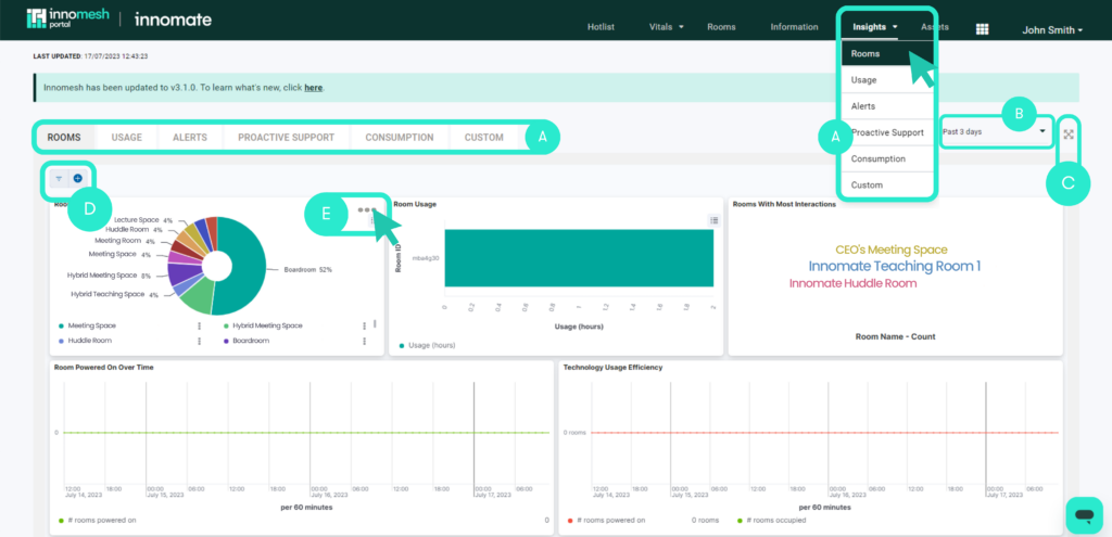
A. Navigation bar
The top navigation bar allows users to move between Vitals categories, such as the network, rooms, and custom.
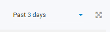
B. Insights period
The time period in which the vitals are displayed can be adjusted, with several values between 30 minutes and the past 7 days.
C. Fullscreen
This button allows Fullscreen-mode which is ideal for displaying in an AV or IT operations office.
D. Custom filter/query
Custom filters and queries can be added on top of the default vitals page.
E. Insight specific controls
Individual vitals can be adjusted here, time ranges customized, graphs maximized and the API calls to the Elastic search can be inspected.
Rooms
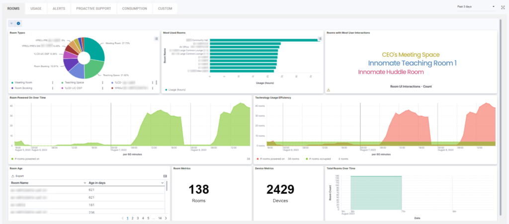
At a glance, the following metrics are displayed:
- Room Types
- Most Used Rooms
- Rooms with Most User Interactions
- Room Powered On Over Time
- Technology Usage Efficiency
- Room Age
- Room Metrics
- Total Rooms Over Time
We will explore some of these metrics below.
Room Types
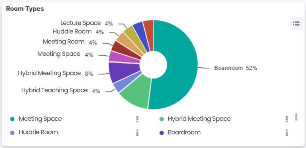
This graph displays different room types, and when segments are hovered over, display name, number of rooms, and the percentage of those room in comparison to the other rooms. The view of this pie chart can also be toggled by clicking the top right button.
This visual provides a bird’s eye view of the percentage of the total rooms of rooms that are deployed under different templates. This helps to give a birds-eye of how standardised your systems are.
Most Used Rooms
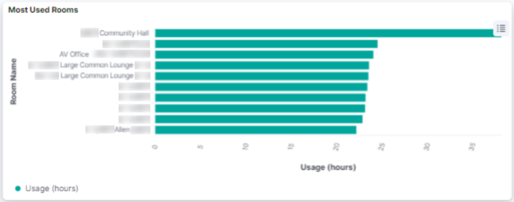
This graph provides a visual of rooms most frequently used and their hours of use across the specified period in the top right corner of the page.
Rooms with most user interactions
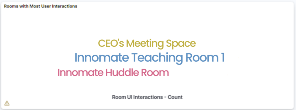
This graphic shows rooms that users most commonly interact with at a glance, with the bigger text signifying more interactions, and smaller text signifying lesser interactions. The user interactions originate from either via the in-room UI or the X-panel/VNC.
Rooms powered on over time
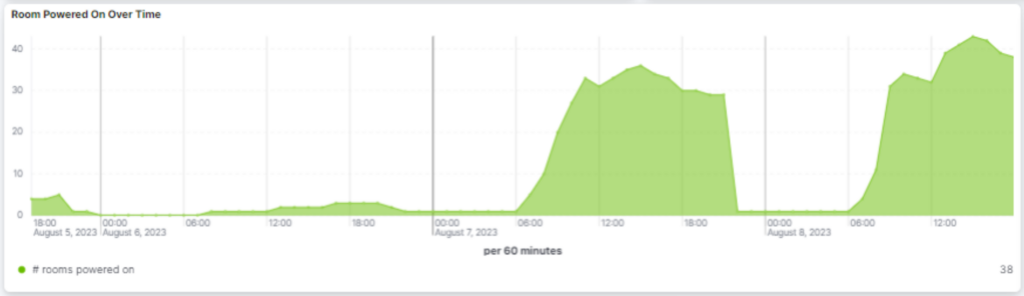
The rooms over time allows you to track the deployment of rooms over a given period of time. The time period is adjustable with options from today, last 90 days, last year and more.
Technology Usage Efficiency
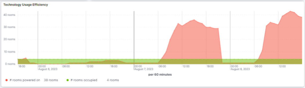
This graph displays the number of rooms powered on, and the numbers of rooms occupied over a period of time – showing specific numbers when the dots are hovered. The user also has the option to highlight either rooms powered on/rooms occupied, by hovering in the key. Users can also remove options from view in the graph by clicking in the key. The time period is also adjustable.
Room Age
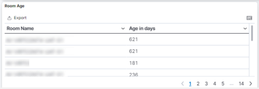
This section shows how long each room has been provisioned for, from order of oldest to earliest. You can adjust the order by clicking either of the column headings.
Room and device Metrics
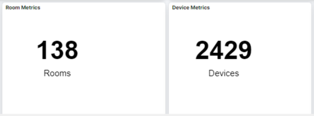
Provides a snapshot of total rooms and devices. A more detailed graph of room count is seen in the subsequent graph:
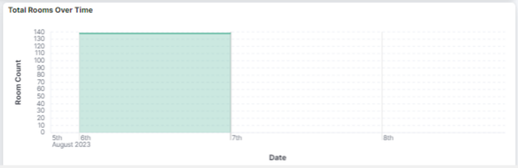
The time frame and view can be toggled.
Usage
At a glance, the following metrics are displayed
- Source usage
- Display usage
- Most used sources
- Source usage over time
- Most used devices
- Most common user interactions
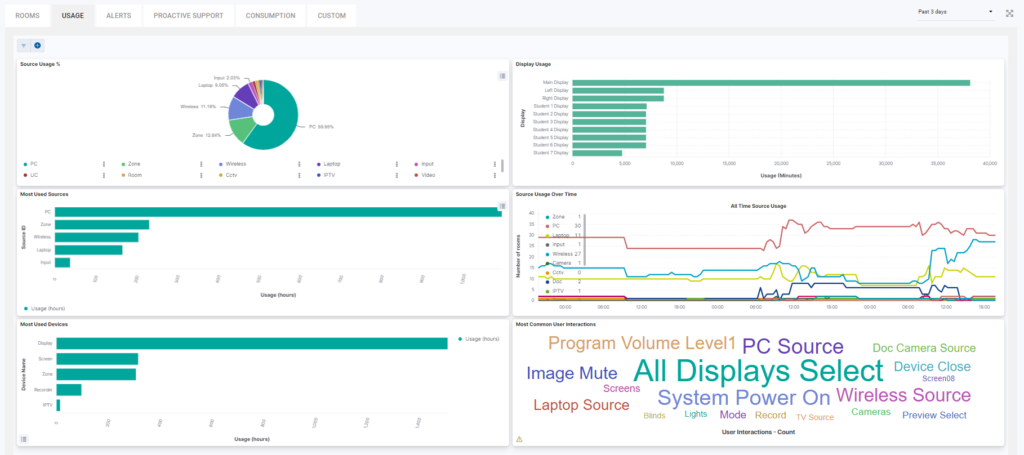
Source Usage
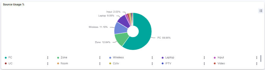
This source usage graph displays visual of sources and how often they are used, with labelled segments. This view can also be toggled with/without the graph key.
Device Usage
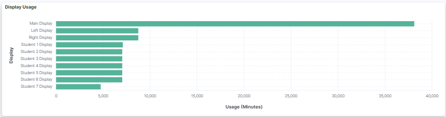
Similar to the Source Usage graph, the device usage graph also displays how often devices are used, as a percentage amount. When the graph is hovered over, the precise percentage and hours amount is shown.
Most Used Sources
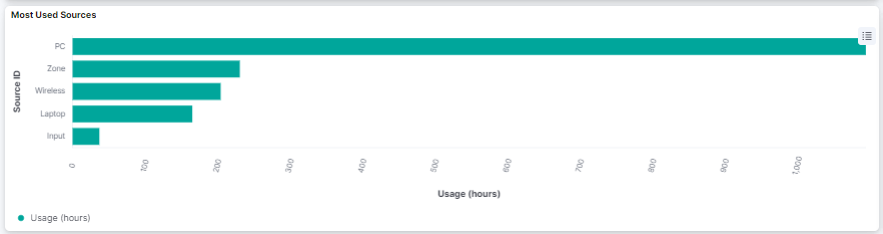
This bar graph displays the hours each source has been used for over the period specified in the top right corner of the page.
Source Usage Over Time
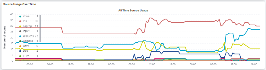
Provides a visual for users to view devices that are simultaneously online at any given time, as well as the increase/decrease of used sources over time. The time frame view can be customised, and hovering over the graph prompts a popup detailing specific devices on during that specific time. The sources can also be isolated, by selecting the source in the key.
Most Used Devices
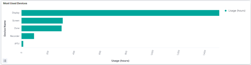
This bar graph displays the hours each device has been used for over the period specified in the top right corner of the page.
Most Common User Interactions
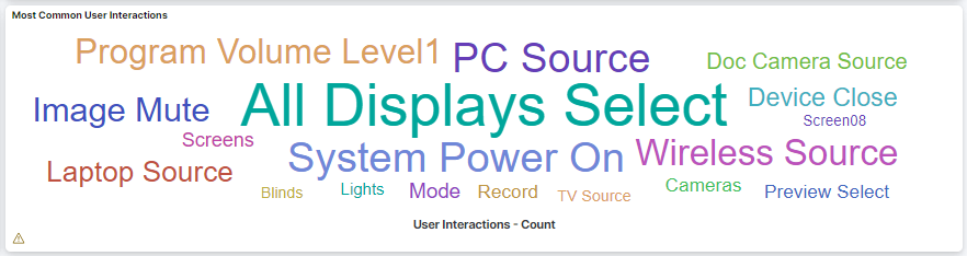
This graphic shows interactions that are most common to users at a glance, with the bigger text signifying more interactions, and smaller text signifying lesser interactions.
Alerts
Alerts include the metrics displayed below:
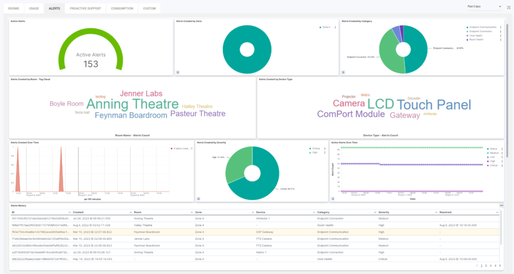
- New alerts
- Alerts by zone
- Alerts by category
- Alerts by room
- Alerts by device type
- Active alerts over time
- Alerts by severity
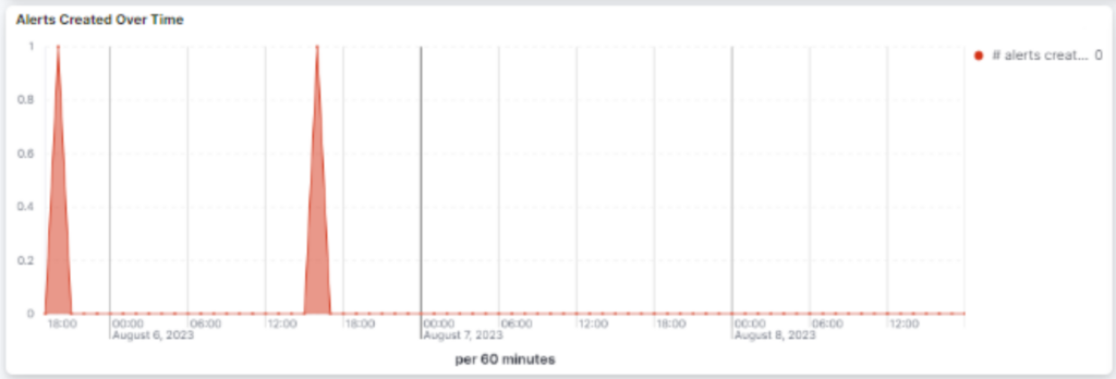
- Alerts created over time
- Alert history
New alerts
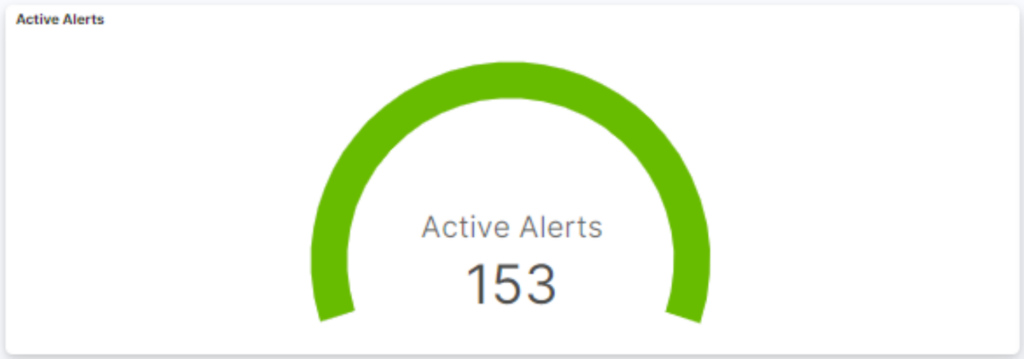
The New Alerts graphic is an ‘at glance’ graphic shown above. The time frame can be adjusted by clicking the 3 dots on the top right.
Alerts by zone
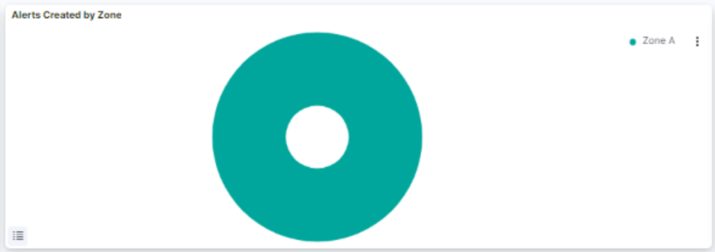
Alerts by zone display the most and least common zones that have triggered alerts. When data is hovered over, a specific percentage amount is displayed.
Alerts by category
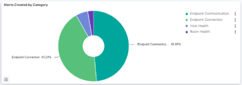
Alerts by Category displays the different types of alerts that have been activated, and allows users to identify specific, as well as most/least common issues. A percentage amount and number of alerts is shown when the graph is hovered over.
Alerts By Room
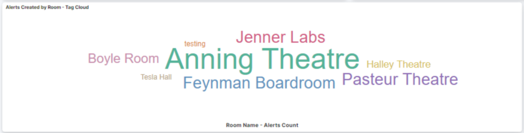
This graphic shows rooms that most commonly activate alerts, with the bigger text signifying more alerts, and smaller text signifying lesser alerts.
Alerts by Device Type
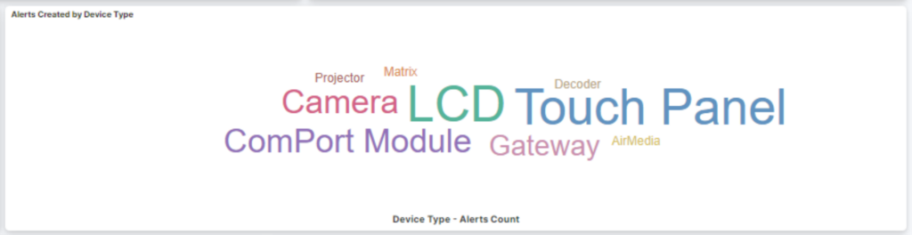
This graphic shows devices that most commonly activate alerts, with the bigger text signifying more alerts, and smaller text signifying lesser alerts.
Active alerts over time
This graph allows users to notice any irregularities in the number of alerts, as well as the level of urgency of each alert. Alert types can be highlighted by clicking on the key. The time frame can also be adjusted.
Alerts By Severity
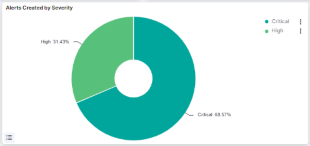
Alerts by Severity provides a snapshot of percentages of alerts, ranging from low to critical. When hovered over, the graph reveals specific numbers of alerts and percentages.
Active Alerts Over Time
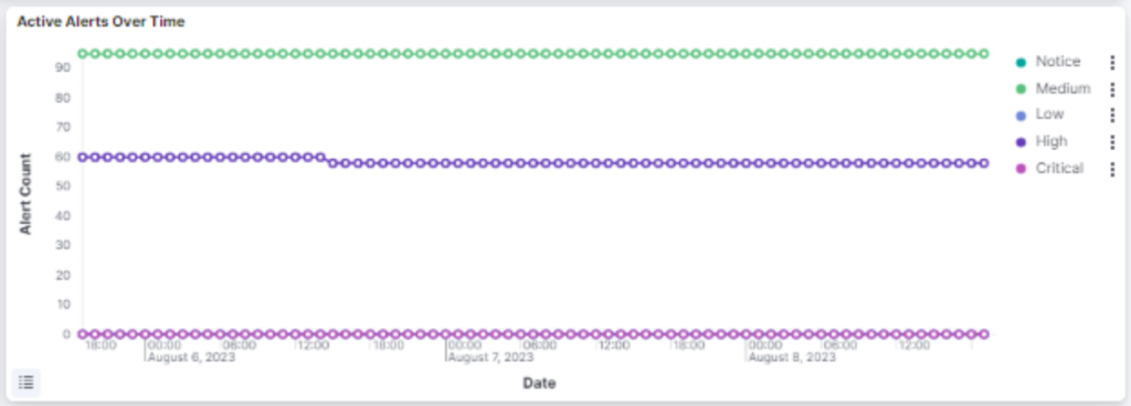
Shows the amount of alerts over an period of time. This time frame can be adjusted, and users can also view amounts of alerts at a specific point in time.
Alerts History
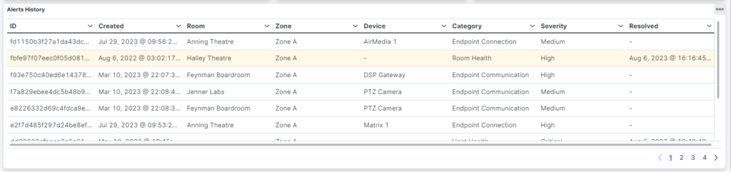
This view shows the most recent alerts which have shown on the Hotlist. The fields for each alert as as follows:
- ID – The unique ID of the alert, which is referenced by the Innomesh software.
- Created – The time and date the the alert was created.
- Room – The room in which the alert originiated.
- Zone – The zone which was active when the alert eventuated to the Hotlist.
- Device – The device associated with the alert.
- Category – The category of the alert i.e. Endpoint connection or communication.
- Severity – The severity of the alert.
- Resolved – The time and date the the alert was resolved. If the alert is still active this field will be blank.
Proactive Support
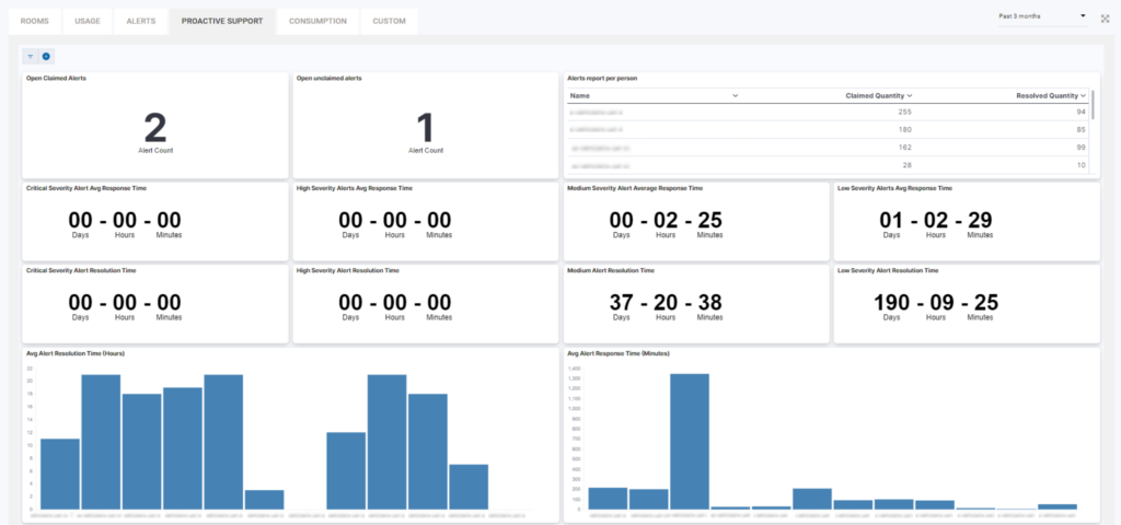
The Proactive Support page provides a snapshot of various response times to alerts, as well as additional information on individuals that have responded to these alerts. Some metrics include:
- Open claimed alerts – The amount of alerts in the Hotlist that are claimed.
- Open unclaimed alerts – The amount of alerts in the Hotlist that are unclaimed.
- Alerts report per person – Users, with the amount of claimed and resolved alerts.
- Critical severity alert average response time and resolution time – The average response and resolution times for a critical severity alert.
- High severity alerts average response time and resolution time – The average response and resolution times for high severity alerts.
- Medium severity average response time and resolution time – The average response and resolution times for medium severity alert.
- Low severity alerts average response time and resolution time – The average response and resolution times for low severity alerts.
- Graph of average alert resolution time (Hours) – Average alert resolution times in hours, per user.
- Graph of average response time (Minutes) – Average alert resolution times in minutes, per user.
The time frame for these metrics can be adjusted, on the top right of the page.
Sight
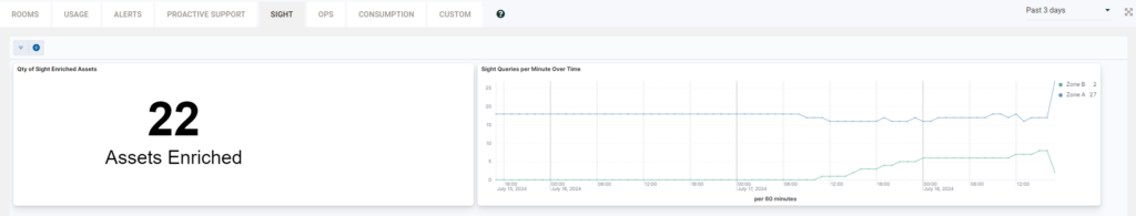
This dashboard shows us Sight metrics
- Qty of Sight Enriched Assets – The amount of devices that have been enriched with Sight.
- Sight Queries per Minute Over Time
OPS
Here we can get more insights about OPS usage across the whole tenancy.
- Ops Actions Triggered Over Time – User actions that have been triggered over time.
- Most Triggered Ops Actions – Actions that have been triggered mostly by users.
- Rooms with Most Ops Actions Triggered – This shows the rooms with most actions triggered by users.
- Top 10 Ops Users – Shows the name of the top 10 OPS users.
- Ops Trigger History – This field shows the history of OPS actions triggered.
Consumption
In Consumption we monitor all the subscriptions within the innomesh portal, so that, every one of them is presented in detail as the Space VC, Space CE, Sight and Pulse subscriptions. This page gives us visuals on subscriptions that are used per day, over time, current time, in total and even per month.
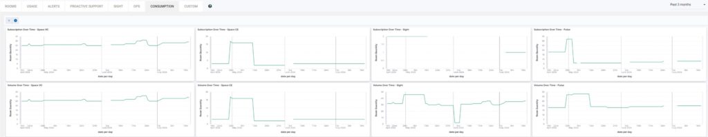
- Subscription Over Time – Space VC – Shows visuals of Space VC subscriptions used in rooms over time.
- Subscription Over Time – Space CE – Shows visuals of Space CE subscriptions used in rooms over time.
- Subscription Over Time – Sight – Shows visuals of Sight subscriptions used in rooms over time.
- Subscription Over Time – Pulse – Shows visuals of Pulse subscriptions used in rooms over time.
- Volume Over Time – Space VC – Shows visuals of the volume of Space VC subscriptions used in rooms over time.
- Volume Over Time – Space CE – Shows visuals of the volume of Space CE subscriptions used in rooms over time.
- Volume Over Time – Sight – Shows visuals of the volume of Sight subscriptions used in rooms over time.
- Volume Over Time – Pulse – Shows visuals of the volume of Pulse subscriptions used in rooms over time.
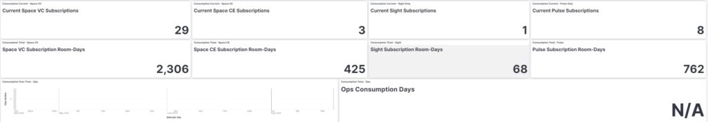
- Consumption Current – Space VC – Shows the number of current Space VC subscriptions used in rooms.
- Consumption Current – Space CE – Shows the number of current Space CE subscriptions used in rooms.
- Consumption Current – Sight Only – Shows the number of current Sight subscriptions used in rooms.
- Consumption Current – Pulse Only – Shows the number of current Pulse subscriptions used in rooms.
- Consumption Total – Space VC – Shows the number of total Space VC subscriptions used in rooms.
- Consumption Total – Space CE – Shows the number of total Space CE subscriptions used in rooms.
- Consumption Total – Sight – Shows the number of total Sight subscriptions used in rooms.
- Consumption Total – Pulse – Shows number of total Pulse subscriptions used in rooms.
- Consumption Over Time – Ops – Shows visuals of the overall subscriptions used over time in OPS.
- Consumption Total – Ops – Shows visuals of the total subscriptions used over time in OPS.
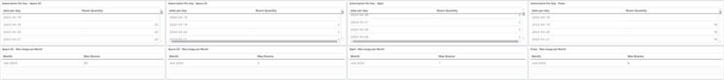
- Subscription Per Day – Space VC – Shows information of Space VC subscriptions used per day.
- Subscription Per Day – Space CE – Shows information of Space CE subscriptions used per day.
- Subscription Per Day – Sight – Shows information of Sight subscriptions used per day.
- Subscription Per Day – Pulse – Shows information of Pulse subscriptions used per day.
- Space VC – Max Usage per Month – Shows information of maximum Space VC subscriptions used per month.
- Space CE – Max Usage per Month – Shows information of maximum Space CE subscriptions used per month.
- Sight – Max Usage per Month – Shows information of maximum Sight subscriptions used per month.
- Pulse – Max Usage per Month – Shows information of maximum Pulse subscriptions used per month.
Custom
The custom tab can be populated with a mix of visualisations from multiple tabs outlined within this article or completely new visualisations custom to your tenancy. This is set up based on each client’s needs. If you see the below alert, reach out to us with a list of visualisations you’d like us to populate your custom tab with.
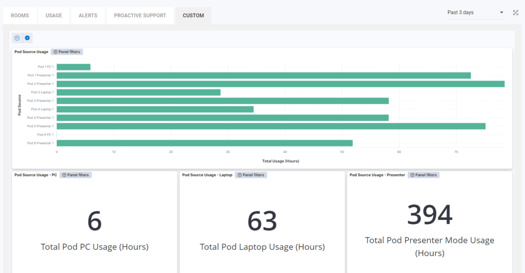
Below is an example from a tenancy which shows Pod usage insights.
Below is an example of one tenancy with a mix of visualisations from various tabs.
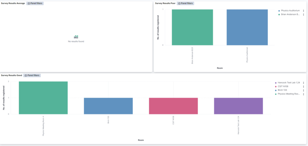
This tab pulls the data from Innomesh’s servers, and can reflect a variety of different information sources. For example, microphones batteries that with the least amount of charge, the highest lamp hours for projectors etc.