The Vitals page provides metrics on the inner workings of Innomesh. Here we can see the efficiency and responsiveness of the system as a whole. Also we get in-depth technical insight on the network infrastructure and the status of the rooms and assets.
Infrastructure
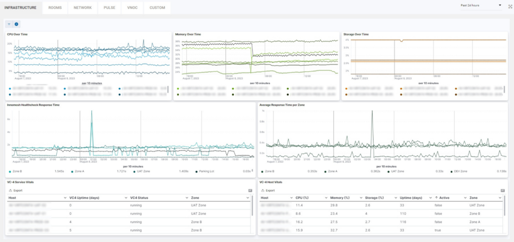
In this tab we have the following metrics:
- CPU Over Time
- Memory Over Time
- Storage Over Time
- Innomesh Healthcheck Response Time
- Average Response Time per Zone
- VC-4 Service Vitals
- VC-4 Host Vitals
We will explore some of the metrics below.
CPU Over Time
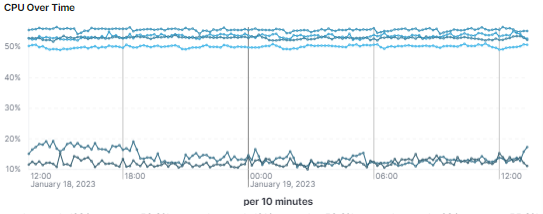
This chart provides us with information on the CPU usage of the servers in use.
Memory Over Time
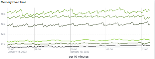
This chart gives us the memory usage of the servers in use.
Storage over time
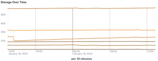
Looking at this metric we can tell how much of the available storage each server is using.
Innomesh Healthcheck Response Time
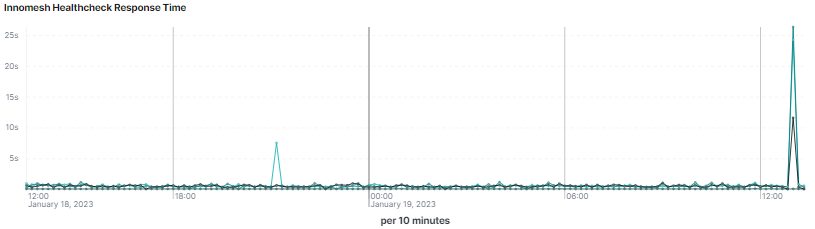
A very important metrics and an easy way to tell if everything is working as intended. Looking at this chart can tell us the response time of the rooms and help us notice potential problems and resolve them proactively even before the user is aware of them.
Average Response Time per Zone
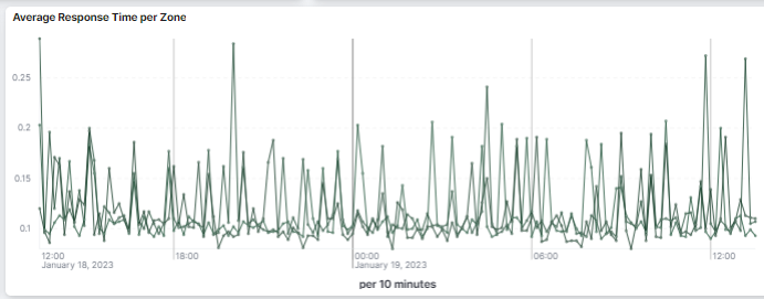
Here we have the average response time per zone which can help in noticing trends and patterns that signal a potential problem.
VC-4 Service Vitals
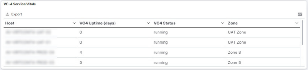
This list gives us all VC-4 servers with their respective uptime, status and zone. There is an option to export this data in a raw or formatted way.
VC-4 Host Vitals
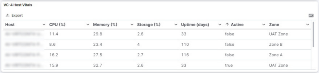
Here we can find the same servers as above with their active status and vitals.
Rooms
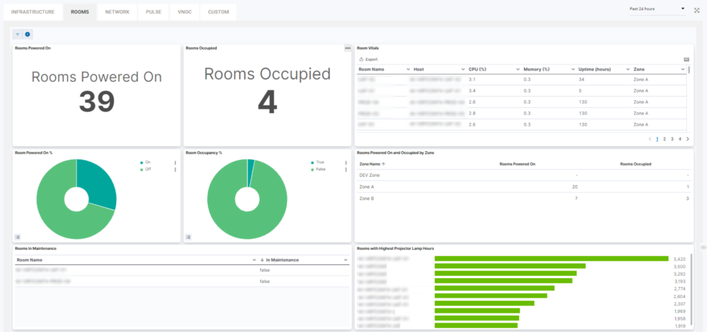
At a glance, the following metrics are displayed:
- Rooms powered on
- Rooms occupied
- Room vitals
- Rooms powered on (%)
- Room occupancy (%)
- Rooms powered on and occupied by zone
- Rooms in maintainence
- Top 10 projector lamp hours
Rooms Powered On & rooms occupied
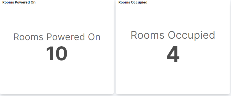
These graphics provide an at glance view of the number of rooms that are powered on and rooms currently in use.
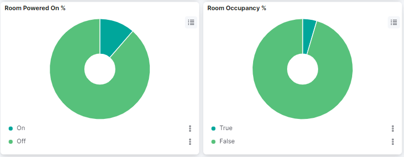
A visual graph of these statistics is also provided, displaying additional information when hovered.
Room Vitals
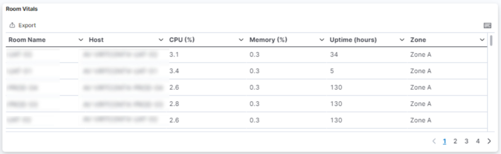
The room vitals tab provides specific information about usage (CPU %, Memory %), uptime, location, and host. This information can also be exported by clicking the top left ‘export’ button.
Rooms Powered On and Occupied by Zone
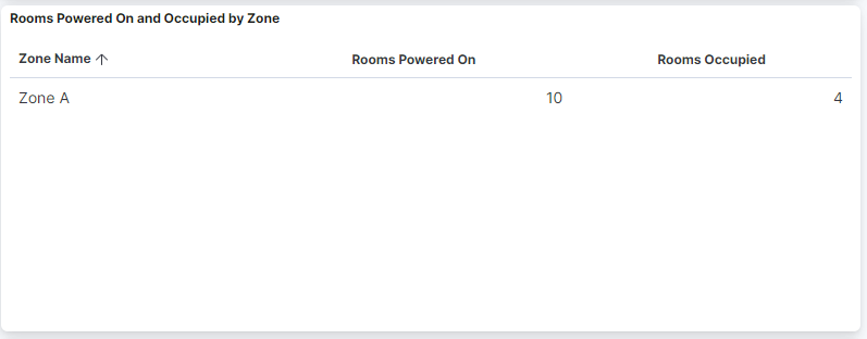
Displays the number of rooms powered on and occupied by zone.
Rooms In Maintenance
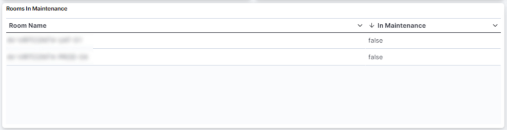
Provides a list of rooms that are currently undergoing maintenance .
Top 10 Projector lamp hours
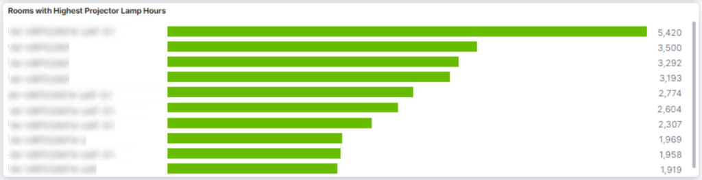
This displays the 10 most used projectors labelled by room.
Network
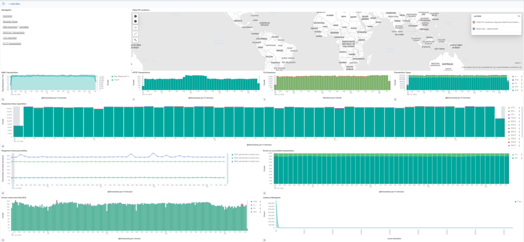
This section gives a glance at different network statistics.
- Client IP Locations
- DNS Transactions
- HTTP Transactions
- TLS Sessions
- Transaction Types
- Response times repartition
- Response times percentiles
- Errors vs successful transaction
- Errors count over time
- Latency Histogram
Client IP Location
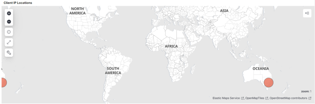
Here we can see the world map with each red dot representing user connected to Innomesh.
DNS Transactions
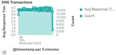
This graph represents how many times the DNS server resolves a hostname into IP address.
HTTP Transactions
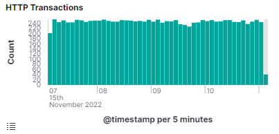
Connections to the server every 5 minutes.
TLS Sessions
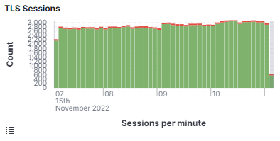
How many secure sessions are established per minute.
Transaction Types
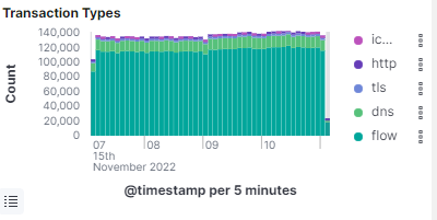
Here we can see quantitative division of the different types of transactions.
Response times repartition
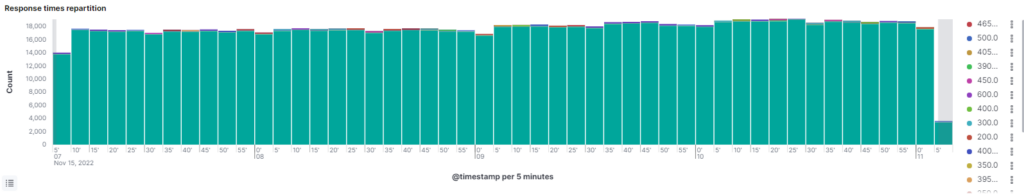
How long does it take to get a response from the server.
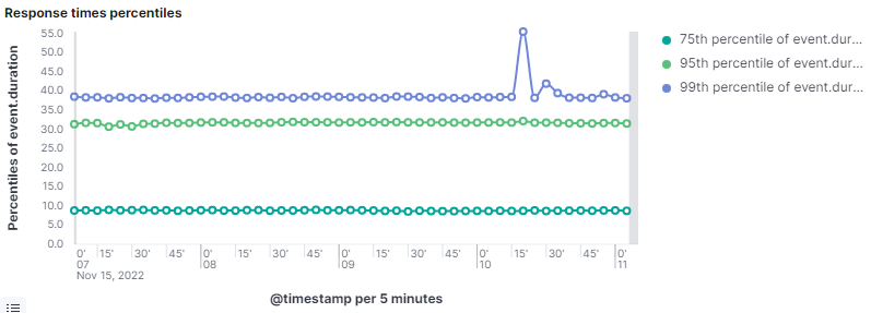
Response times percentiles
Errors vs successful transactions
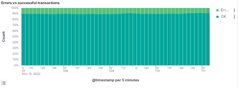
Comparison between successful and unsuccessful transactions.
Errors count over time ECS
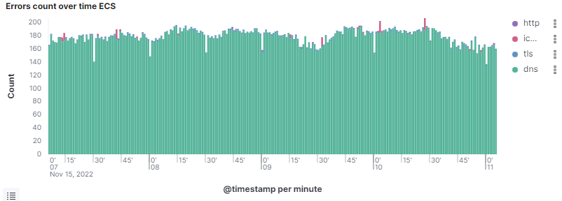
On this graph we can see where do most of the errors come from.
Latency Histogram
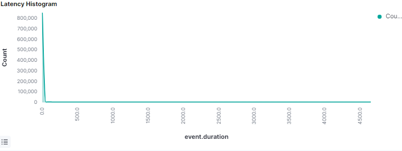
Latency is the amount of time between when a request starts and when it completes.
Pulse
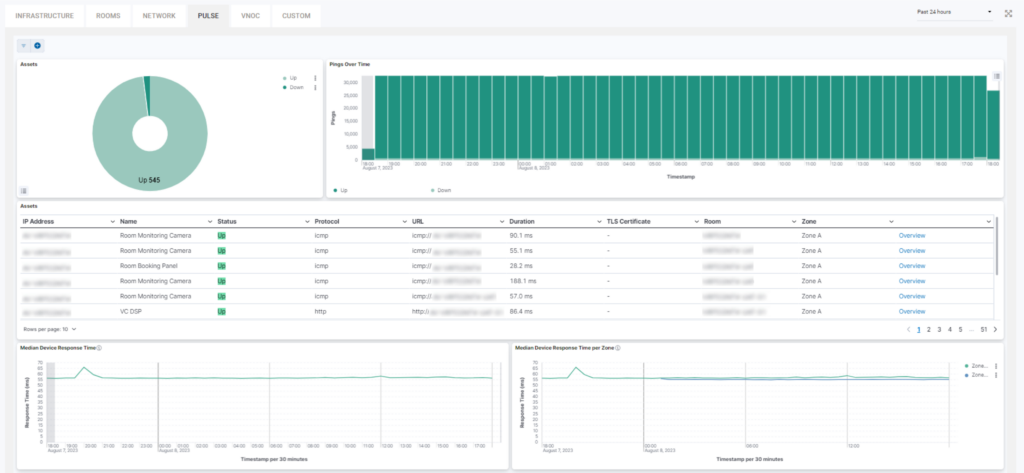
Pulse represents monitoring utilising the IMTP protocol to tell if an asset if online or offline.
Here we can find:
- Assets Up and Down
- Pings Over Time
- Assets
- Median device response time
- Median device response time by zone
Assets
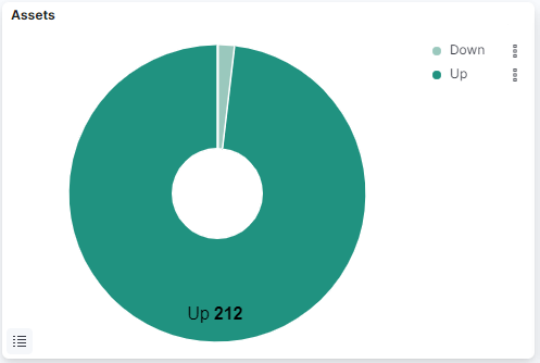
On this pie chart we have a representation of the number of devices that are online and offline.
Pings over time
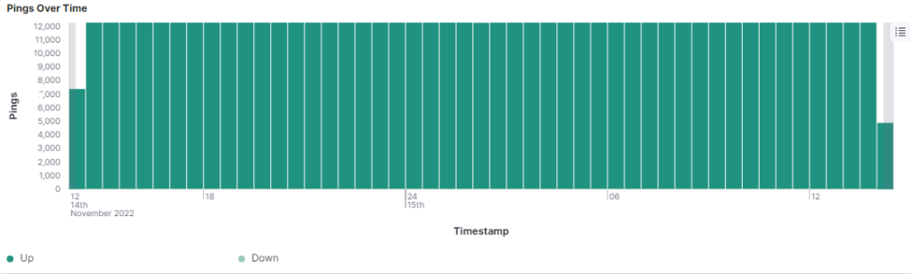
Here we can see the number of times Pulse reached to the devices to check their status.
Assets
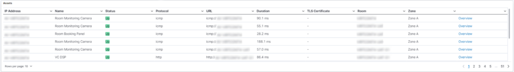
List of every asset connected to Pulse with additional information including Status, IP Address, Location etc.
Median Device response time
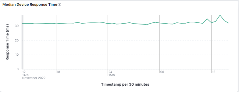
On this chart we can see how long (in milliseconds) it takes for the device to respond.
Median Device Response Time per Zone
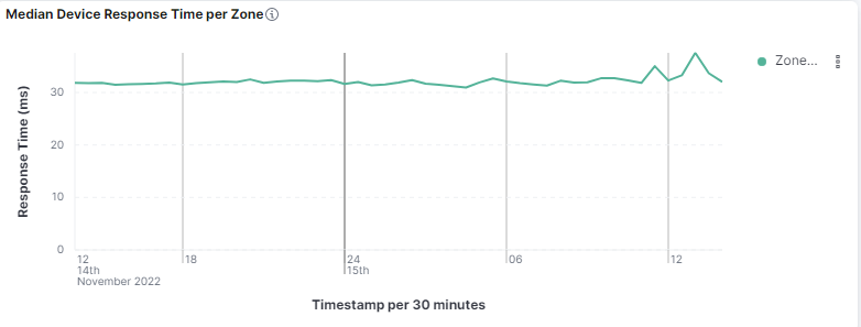
On this chart we can see how long (in milliseconds) it takes for the device to respond divided by zones.
Sight
In this section is presented the momentary state of the devices in the rooms. This section serves as device monitoring and provides expanded information of the devices.
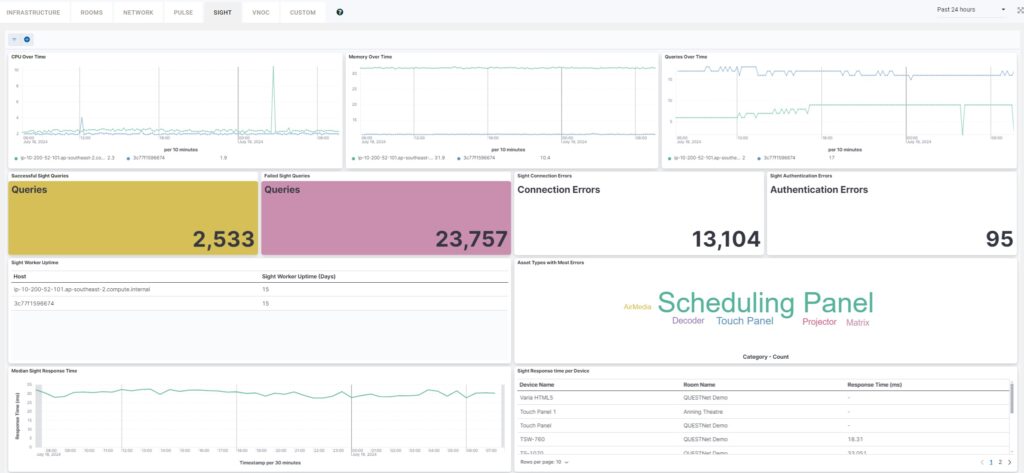
In Sight we can see the following fields:
- CPU Over Time – This chart provides us with information on the CPU usage of the servers in use.
- Memory Over Time – This chart gives us the memory usage of the servers in use.
- Queries Over Time – This chart gives us the extracted information from the database.
- Successful Sight Queries – This field gives us the number of successful pings of devices.
- Failed Sight Queries – This field gives us the number of unsuccessful pings of devices.
- Sight Connection Errors – This field gives us the number of unreachable devices.
- Sight Authentication Errors – This field gives us the number of Sight authentication errors.
- Sight Worker Uptime – This field gives us list of host’s uptime in days.
- Asset Types with Most Errors – This field gives us the device types where most errors has been detected.
- Median Sight Response Time – This chart gives us the average response time.
- Sight Response time per Device – This field gives us the response time reaching a certain device.
VNOC
This section serves as visual alerts monitoring page where we can get clear insight when issues arrise in the system.
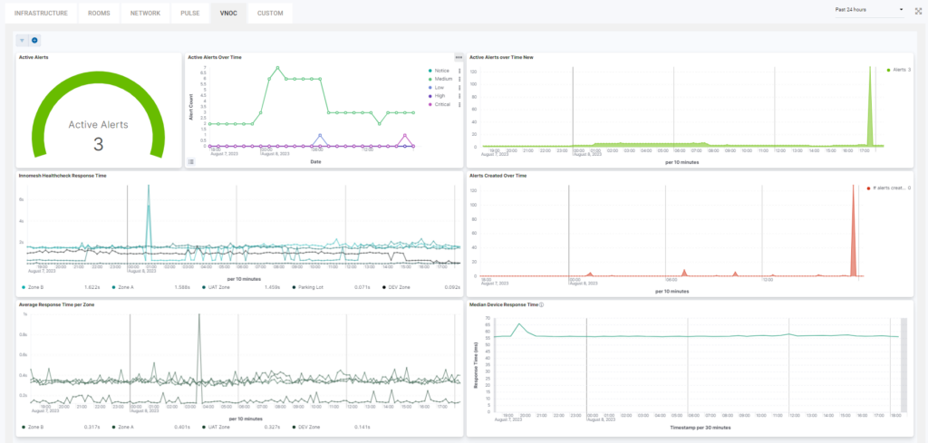
We can see the following fields:
- Active Alerts – Shows us the momentary active alerts in the system.
- Active Alerts Over Time – Shows us the active alerts over a period of time and date.
- Active Alerts over Time New – Shows us the active alerts per 10 minutes time frame.
- Innomesh Healthcheck Response time – Shows us the response time of reaching certain rooms.
- Alerts Created Over Time – Shows us the alerts created over a 10 minutes time.
- Average Response Time per Zone (TSVB)(converted) – Shows us the average response time per zones in the portal for every 30 minutes.
- Pulse Device Response Time – Shows us the Pulse device response time per 10 minutes.
Custom
The custom tab can be populated with a mix of visualisations from multiple tabs outlined within this article or completely new visualisations custom to your tenancy. This is setup based on each clients needs. If you see the below alert, reach out to us with a list of visualisations you’d like us to populate your custom tab with.
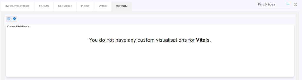
Below is an example of one tenancy with a mix of visualisations from various tabs.
At a glace we can see the following fields:
- Active Alerts
- Active Alerts Over Time
- Active Alerts over Time New
- Innomesh Healthcheck Response time
- Alerts Created Over Time
- Average Response Time per Zone
- Median Device Response Time